At last the time has come. We have been waiting for this moment for a long time. Now the structure that has been standing all dull and colorless for a long time, won’t be gray anymore. Finally, the paint works at our house will finally be starting today.
First things first, we decided color scheme for our house; both indoors and outdoors, at the time when we were finalizing the house plan. This is very important, especially if you are living in a housing society.
Housing society management will ask you to submit ‘Front Elevation’. Once your house is ready, management will send an inspection team and they will compare your house with the plans you submitted earlier. Front elevation design and colors should be as close to submitted designs as possible.
You can make small understandable changes but it should not change the look of your house. If you did and the house looks different, they will ask you to submit the plans again and it will cost you extra money, energy and time. So its best to plan ahead.
Okay what was your color scheme?
We went with lighter colors. I’m sure that is no surprise because most of us prefer lighter colors. In Punjab, Pakistan, where weather is warm for most part of the year; lighter shades not only look pleasant but they are also very functional. Light colors repel sunlight, in-turn keeping the walls less warm.
As we discussed before, our house is not on a corner plot. This means that we can only add windows to the front and back side of our house. So some of our rooms don’t have direct sunlight (we added OTS to bring sunlight and air into those rooms), light colors in those rooms and OTS walls also helped and made those rooms quite bright.
For Walls:
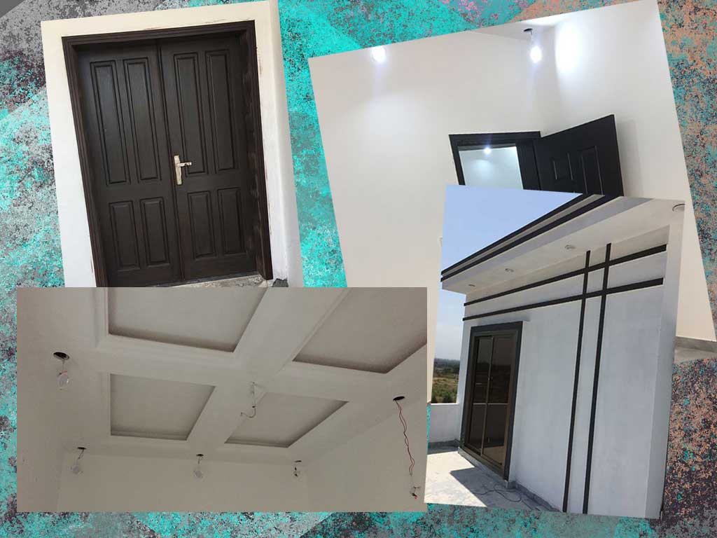
For walls, we chose off-white color. The best thing about this color is that it looks white, but it doesn’t get dirty as quickly as the pure white does. Is it just me or do we all think that just a speck of dust ruins the whole white wall?
Off-white color gives a warm but fresh look to the room, and it significantly brightens-up the room.
For Ceiling:
The color we chose for our ceiling (false ceiling in our case) is pure white. We chose pure white because it compliments the light fixtures installed in our ceiling. Also our floor tiles are a bit darker so white ceiling makes a nice contrast.
For Doors:
Initially we were planning to color our doors brown; the typical brown doors you see everywhere. Our builder came up with this idea and he said: “If the walls and ceiling are of lighter shades and floors are a bit darker, shouldn’t doors be also darker”?
We really liked this idea and looked up a couple of options. The color we finally chose was Matt Brown. It is very dark, non-glossy, almost black kind of brown color, which when we saw on our doors; we absolutely fell in love with it.
It goes really well with the floor tiles and matt brown doors look really great between the plain white walls. I’m not going to lie, plain white walls and white ceiling started to look quite dull. When the team started to polish the doors, it brought a whole new life into the rooms. Between glossy floors and walls, matt brown doors give a very premium look.
Outdoor walls
Outdoor walls are mostly off-white. As a contrast, we added brown color to some design aspects of our front elevation. Our front elevation has some borders, lines and boxes to make the design a bit interesting and modern. We kept all the front walls white and painted all the lines and boxes brown. We think these two colors compliment each other really nicely and once finished; it will look great.
There is still a lot to do plenty of small challenges are ahead of us, but we are enjoying them and always ready for the new ones. Let us know if you have any suggestion for us. If you have any questions feel free to comment below.
